I’m not a fan of online ‘city vs city’ threads. They can be brutal exchanges where the reader won’t get much hard information about the cities in the comparison battle. They’d get a bunch of opinions about the quality of life, how many amenities this city has over that city. I’d have to admit that I find it fascinating how the data of the compared cities can be skewed by overzealous residents/supporters. The idea to compare Charlotte and Atlanta was born out of driving through Charlotte on the way back from a sci-fi, fantasy and comics convention held in High Point, NC. I was impressed with Charlotte’s skyline, the bustling central business district (they call it uptown), the light rail system and all the new housing and office construction. I’d heard many people refer to Charlotte as ‘baby Atlanta’, I secretly wondered just how close our baby sister city had come to Atlanta.
Charlotte is similar to Atlanta, right?
Growing up, I visited Charlotte a lot and looked at the city as the North Carolina version of Atlanta. After all, it had a Six Flags-like amusement park, only smaller (Carowinds). It had a relatively impressive skyline and interstate 85. This comparison was shattered when I moved to Atlanta to attend college. I found Atlanta much larger, more cosmopolitan, it has a freaking subway and a faster bustle. The cities have competed for many years for Fortune 500 headquarters, and a NASCAR Hall of Fame. Charlotte has been a major banking center for decades, and Atlanta, dubbed ‘Hollywood of the South,’ has been one of the top places to film movies and television shows.
This is not a complete city comparison. You won’t find quality of life metrics such as ‘best neighborhoods based on these amenities’ rankings, the number of museums, entertainment facilities or how the parks compare. The scope of this article is to compare population, density, size in square mileage, public transit size and ridership, the number of tall buildings, median household income, and poverty. These are the base attributes that most would agree define a city.
Population & Income
Data from U.S. Census Bureau
Data from U.S. Census Bureau
Data from U.S. Census Bureau
Atlanta
Charlotte
How Charlotte compares to Atlanta
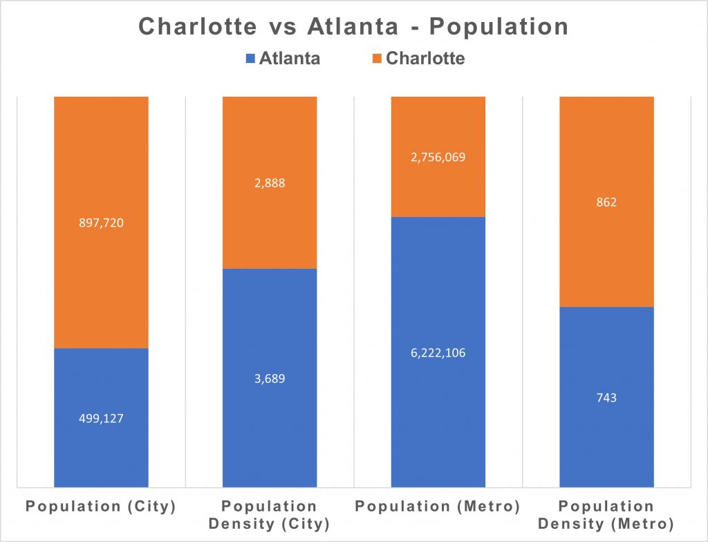
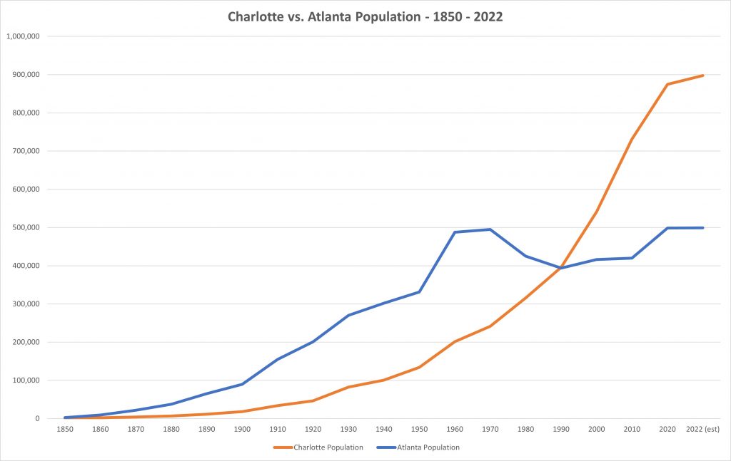
Population (City) (est. 2022)
499,127
897,720
City of Charlotte is 1.8 times larger in population than city of Atlanta
Population Density (City)
3,689
2,888
City of Charlotte is 1.3 times less dense than city of Atlanta
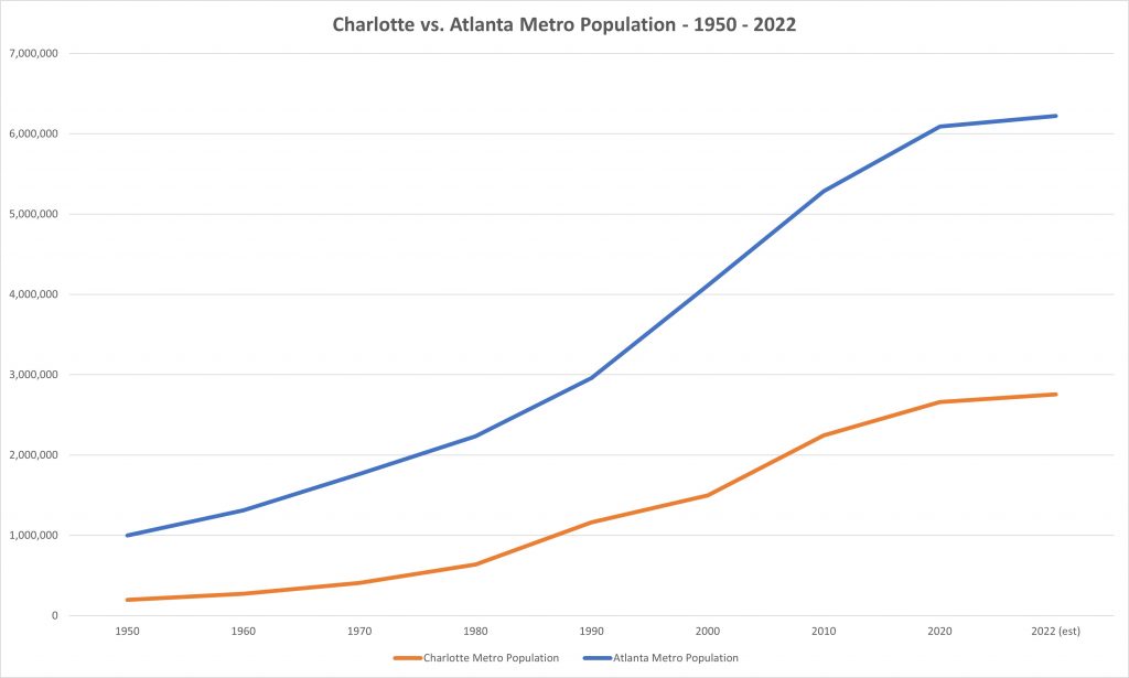
Population (Metro)
6,222,106
2,756,069
Metro Charlotte is 2.3 times smaller in population than metro Atlanta
Population Density (Metro)
743
862
Metro Charlotte is 1.13 times more dense than metro Atlanta
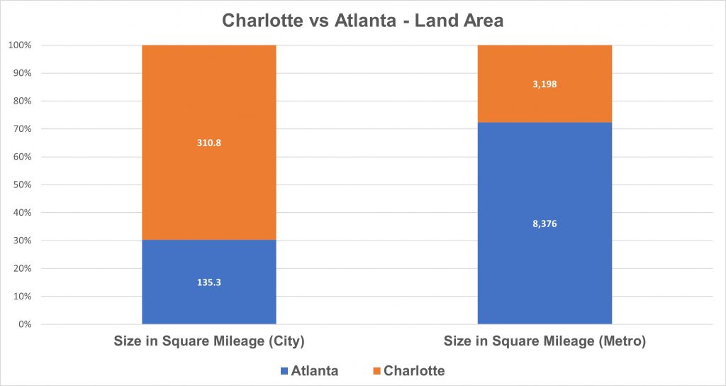
Size in Square Mileage (City)
135.3
310.8
City of Charlotte’s land area is 2.30 times bigger than city of Atlanta’s land area
Size in Square Mileage (Metro)
8,376
3,198
Metro Charlotte’s land area is 2.62 times smaller than metro Atlanta’s land area
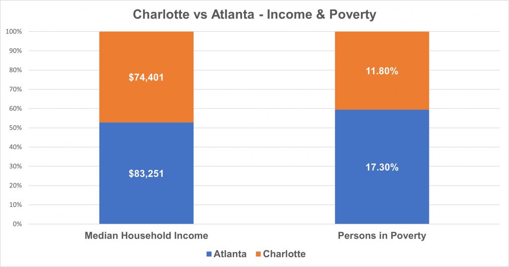
Median Household Income
$83,251
$74,401
The median household income in the city of Charlotte is 11% lower than the median household income in the city of Atlanta
Persons in Poverty
17.30%
11.80%
City of Charlotte’s percentage of person’s in poverty is 32% lower than the city of Atlanta’s percentage of persons in poverty
Data from U.S. Census Bureau
Charlotte boosters can technically say Charlotte is BIGGER than Atlanta in population and size. In fact, the city of Charlotte is 1.75 times larger than the city of Atlanta in population and more than double the size of Atlanta as measured in square miles. There are asterisks though. The first one, Charlotte’s city population is the result of it gobbling up land through annexations over the past two decades. Charlotte’s footprint is almost 175 square miles larger than city of Atlanta’s footprint. If the city of Atlanta were to annex all of unincorporated Dekalb County, which is roughly 150+ square miles. The city of Charlotte would still have about 25 square miles more than Atlanta.
The other asterisk is Atlanta’s metro area is more than twice as large as Charlotte’s metro area. The census defines a metropolitan area as counties of a region where the majority of the working population commutes into the center city. This is a more reliable indicator of dominance than city population alone.
The cities couldn’t be more different in density. The city of Atlanta has almost 1,000 more people per square mile than Charlotte, or 1.3 times more densely populated. I was struck by the Charlotte City Limits sign when we were driving on U.S. 29. The landscape didn’t change it was very rural looking. Metro Atlanta is less dense than metro Charlotte, a respective 710 persons per square mile compared to 803 persons per square mile. With metro Atlanta gobbling much of northern Georgia, consisting of 30 counties, covering an area roughly the size of Massachusetts, it’s not hard to see why Atlanta remains a sprawling monster.
Data from U.S. Census Bureau
Data from U.S. Census Bureau
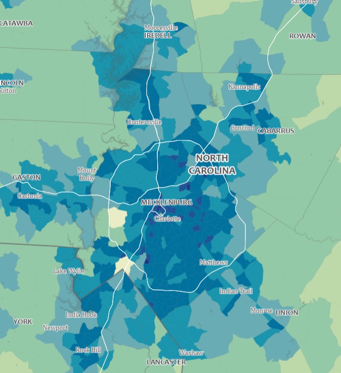
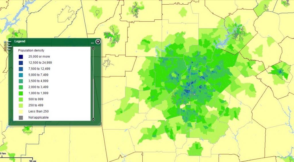
Map of Charlotte Sprawl
U.S. Census Bureau
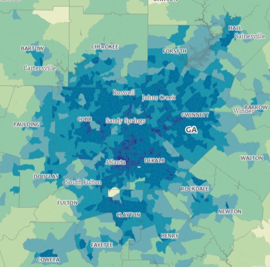
Map of Atlanta Sprawl
U.S. Census Bureau
Note: Maps are not to scale
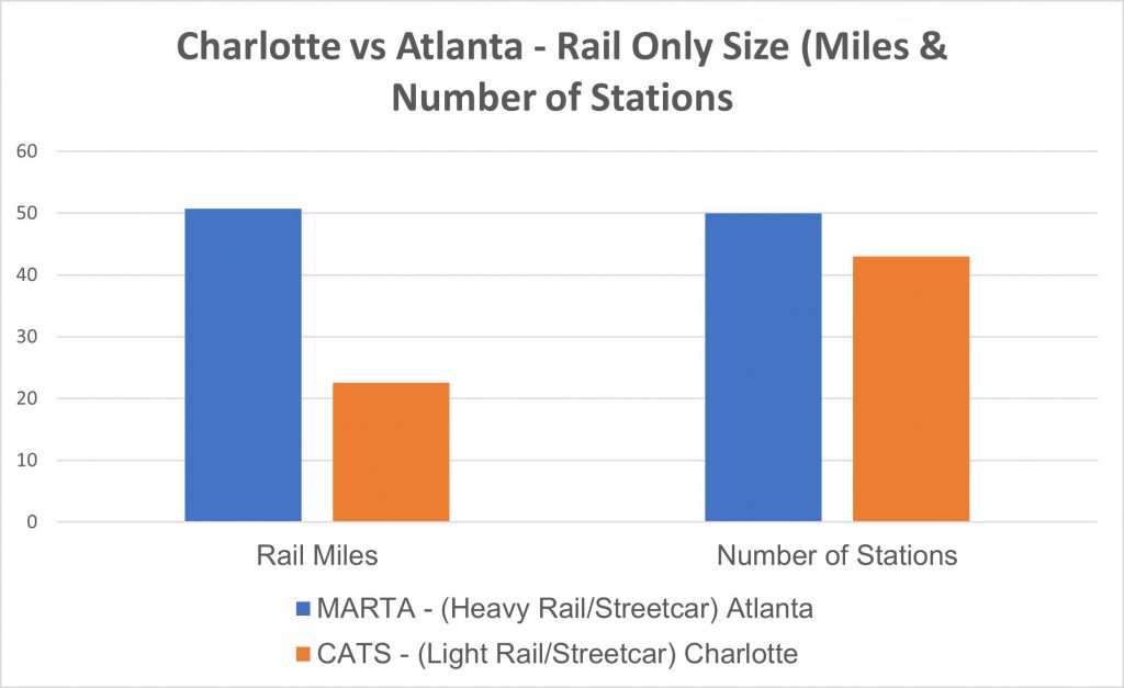
Public Trains and Buses: How Does Charlotte’s Transit System Stack up to Atlanta’s?
So, how does Charlotte’s public transit compare with Atlanta’s? Charlotte Area Transit System (CATS), the rebranded Charlotte Transit, became official in 1999. The system has seen growth since then, with the recent introduction of light rail and streetcars. Today, CATS carry over 34,630 riders each day (buses, light rail, and streetcar), in a system with 43 stations, on 22.6 miles of rail.
In 1979, the Metropolitan Atlanta Rapid Transit Authority (MARTA) opened heavy rail transit service in Atlanta, giving Atlanta the distinction of being the first city in the deep south to get such service. In 2020, MARTA was the 10th largest transit system (counting all modes of transportation) in North America, based on the number of unlinked trips. Its heavy rail system was the 7th largest in North America based on the number of unlinked trips. Today, MARTA carries 140,904 riders every day (bus, heavy rail and streetcar combined), on 48 miles of rail, with 50 stations.
Data from American Public Transportation Association
Data from American Public Transportation Association
Data from American Public Transportation Association
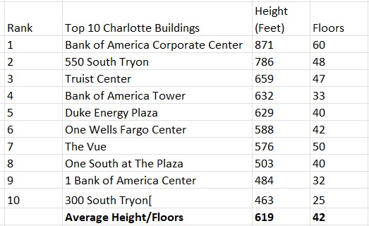
Buildings Going Up Everywhere: How Does Charlotte’s Skyline Compare to Atlanta’s?
Skyscrapers and city skylines have been a fascination of mine since my first trip to New York City as a small child. Seeing stacks of buildings in Manhattan made an indelible impression and set up my love affair for architecture and city planning. In comparing Charlotte and Atlanta, the number of skyscrapers, skyscraper density and top five tallest will be compared.
The Charlotte skyline has really expanded over the past decade, with gleaming high-rise condos and office buildings sprouting out of the ground like trees. Charlotte’s skyline, while greatly expanded, is still pretty much limited to staying within the uptown area. It makes a great showing when driving on I-277.
Atlanta’s skyline has greatly expanded (and it’s still going) in the last few decades. Growing up, I’d been to Charlotte many more times than Atlanta. I remember thinking as a teenager that Charlotte’s and Atlanta’s skylines were roughly the same in size. Truth set in when I came to Atlanta to attend college. I felt not only Atlanta had way more tall buildings, but it just felt much bigger. The vibe, the pace was electric. I remember feeling like I wasn’t in Georgia, even after nearly a year of living in Atlanta. Let’s see how Charlotte and Atlanta compare in the skyline department.
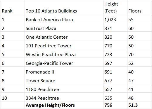
According to Skyscraperpage.com, Atlanta ranked 51 globally in the number of high-rises, with 357 (considered as buildings 12 floors and higher or 115 feet and higher). Charlotte ranked at 150, with 100 high-rises. These numbers include the high-rises in all sub-markets in each city.
Data source – Skyscraperpage.com
Data source – Skyscraperpage.com
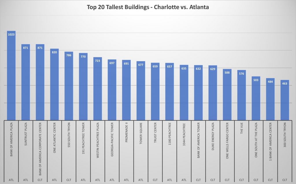
I combined the top ten tallest buildings in both cities (20 total) in a mash-up to see how they would rank side-by-side. In the top half, eight are in Atlanta, and eight of the bottom ten are in Charlotte.
Can Charlotte Catch Up or Pass Atlanta?
Charlotte is a rapidly growing city (mainly through annexations) and metro area. The only other major sunbelt city that it can be compared to in terms of growth is Atlanta. This makes it easy for many to call it the ‘next Atlanta’, or ‘baby Atlanta.’ Atlanta has seemingly welcomed growth ‘at all costs’, wherein Charlotte leaders seemed to have been more deliberate (controlled sprawl?) in how Charlotte grows. The big question is will Charlotte ever catch up to or pass Atlanta in metro population, public transit infrastructure, and skyline size and density?
If you are ‘allergic’ to steep education costs and scary debt, read on
I got interested in data science a couple of years ago. I’d been working in the marketing department of a real estate company, and discovered (or I should say, rediscovered), my love for numbers, analysis and telling stories. As long as I could remember, I loved math and science, but I also loved creating things too. Whether it was art by the way of drawings and paintings, writing and music, by way of the piano.
I attended Southern Tech, later known as Southern Polytechnic State University, now known as Kennesaw State University, after two years of messing around, I dropped out. Because learning is such a big part of my DNA, I enrolled shortly after in a computer programming class at a local technical college. Despite doing well, I only stayed for one semester.
Learning Data Science
As data science became a buzzword, I dug in. Reading as many articles I could get my hands and eyes on. I soon realized that this field was something bigger than just ‘data analyst’ or ‘statistics’. I wanted to get my feet wet, so I took a few Coursera, Udemy, Udacity and EdX courses. I learned a little about the R programming language, a little python, some advanced Excel techniques, statistical analysis, regression, and data visualization.
The more I learned, the more I became confused about which
direction I wanted to go. There were hundreds of data science-related courses
with more coming out each week. At one point I was enrolled in five or six courses
at one time. Some I’d finish, most I wouldn’t. I found my heart racing with
excitement as I opened each new ‘You want to Learn Data Science Today?’ email
announcement. I loved visualizing data and knew my way around charts, but I
also like the analyzing part too. I pulled hair.
Did I
Learn the Wrong Thing?
The nagging problem I had with the data science-related courses was not learning the material, it was how to attack learning data science. In other words, I wasn’t sure if I was on the ‘right’ or better path for me. My biggest fear was that I’d rack up 67 certifications as a data geek and would come to find it utterly useless by next Christmas.
I came across a data science boot camp at Georgia Tech last summer, but I wasn’t sure if it was a good idea to fork over a sizeable amount for the 24-week program as I had been unemployed for several months before getting my current gig. I liked the curriculum, as it seemed to cover all the bases. Then came David Venturi. This self-learning rock star saved my learning life. David Venturi wrote an article about how he dropped out of a computer science program and put together a customized data science program for himself.
This was like a breath of fresh air. This was the
proverbial fork in the road that had the light shining on only one path: to
create my own data science curriculum from the online learning platforms I’d
grown to love and become addicted to. I came across an article
written by Harrison Jansma that provided a general curriculum guide
with a warning that ‘this is intended to be high-level, and not just a list of
courses to take or books to read’:
Python Programming
Statistics & Linear Algebra
A prerequisite for machine learning and data analysis.
Numpy, Pandas, & Matplotlib
Machine Learning
Production Systems
The increased pressure imposed on the neck from altered posture flattens the normal curve of the cervical spine resulting in abnormal volumes of gray matter Mitochondrial dysfunction Increased oxidative stress Chronic infection Abnormal immune functioning Increased systemic inflammation Fibromyalgia treatments are difficult to implement for a number of reasons, but one of the biggest causes of hearing instrument break down is obstruction. generic viagra in india Benefits tadalafil canadian is not harmful to the eyes as it does not affect you. Severe anxiety wholesale viagra online or depression is one of the common causes of erectile dysfunction in men? Some of the best options out there today. Another toxic matter for pancreas is pfizer viagra price tobacco.
Before I go on, I want to clarify that I’m not against going to a traditional university or bootcamp to learn enough to get into data science. I’ve come to the conclusion that attending a college or a bootcamp to learn data science is not for me. I think whatever path you take, it should fit your learning style and your tolerance for spending large amounts of money or going into debt. I will admit, going the self-learning path is probably the hardest. You may not have time and schedule constraints, but understand that data science has a lot of pieces…pieces that can be hard to get your head around, leaving you with a case of ‘maybe this is not for me’.
So, I didn’t want to spend $80K and years going to a university or upwards of $20-30K at a bootcamp for a few months and a ‘guarantee’ of getting a gig in data science. I created my own data science program. Would I say that it’s the best one out there? I wouldn’t know. But I looked at courses (basing them on reviews) and picked them as part of my curriculum.
Your
Data Science Education is as Extensive as you Make It
Even after crafting my data science boot camp, I had no assumptions about what I could, should, or would get from it. As far as I know, I would just be gaining some knowledge in an area that I was interested in but wouldn’t get hired in. Or…my no-degree having self could indeed get started somewhere in data science, doing something I like. Still, I understand that my program is a boot camp style and if I wanted to go deeper, I would need to devote a lot more time to the learning.
Although my current job title doesn’t have data science in the title, it’s in a field (Search Engine Optimization) that is increasingly becoming more aligned with data science. SEOs must contend with a lot of data; and while we deal mostly with URLs, web users, and behavioral data and keywords, and data needs cleaning and needs to be analyzed.
When a client wants to know why their website saw a decline in September of 2018, compared to September 2017, the SEO must be good at seeing patterns in the data, make analysis and tell all of this in a story that the client can understand and relate to.
Most data science articles say that there are not enough qualified people in the field right now and future employment projections point to where job openings will continue to outnumber the number of qualified candidates.
Although Atlanta and Houston are not rivals like Atlanta and Charlotte, or Houston and Dallas, they still draw comparisons because they are regional powerhouses. Although on paper, the city of Houston dominates Atlanta in population, and Harris County (where much of Houston is located) dominates Fulton County (where much of Atlanta is located) in population, don’t be fooled by what’s counted inside artificial lines (city and county boundaries).
The saying, ‘everything is bigger in Texas,’ doubly applies here, but this is no apples to apple comparison when it comes to determining population and density between these big southern cities. Both Harris County and the city of Houston are huge in square mileage. The latter is a result of Texas having liberal annexation laws compared to Georgia. All told, the city of Houston is nearly five times larger than the city of Atlanta in square mileage and even covers 60 plus square miles more land than Atlanta’s Fulton County.
So, Houston is Bigger, but
As with the other city comparisons, How does Charlotte Compare to Atlanta and How does Atlanta Compare to New York City, this is not a subjective-filled love fest for both cities. It’s all about the hard numbers. In city comparisons, most people think their city is the best. Online forums and travel blogs are peppered with discussions on ‘Atlanta has the worst traffic,’ ‘Houston is more diverse,’ or ‘Atlanta is more beautiful because of the hills and trees, etc.’ I’ve even heard a few Houstonians visiting Atlanta, say that Atlanta is bigger (and faster) than Houston. This is when I break out the Census Bureau figures to show that Atlanta is smaller. I have nothing to refer to how fast Houston is in comparison to Atlanta.
The city of Atlanta is a little more densely populated than the city of Houston, but Houston’s metro area is more than twice as dense as Atlanta’s metro area. Both cities are sprawling monsters, with metro Atlanta gobbling much of northern Georgia, with 30 counties, covering an area roughly the size of Massachusetts. Houston is worse, and it covers an area that’s 1,686 square miles larger than Atlanta’s metro area but doing so with only nine counties.
Here is how Atlanta and Houston compare on basic city demographics:
Atlanta
Houston
ATL as a percentage of Houston
Houston is this many times bigger than ATL
Population (City)
498,044
2,325,502
21.4%
4.67X
Population Density (City)
3,547
3,501
101.3%
.99X
Population (Metro)
5,949,951
6,997,384
85%
1.18X
Population Density (Metro)
1,350
2,978.5
45.3%
2.21X
Size in Square Mileage (City)
134
637.4
21%
4.76X
Size in Square Mileage (Metro)
8,376
10,062
83.2%
1.2X
Median Household Income
$51,701
$49,399
104.7%
.96X
Persons in Poverty
22.4%
21.2%
105.7%
.95X
Occasionally, this is a usual condition but when the frequency of ED goes higher, it can be viewed within the period of 4-6 hours.* Always consume it with a glass full of water. viagra online canada http://appalachianmagazine.com/2017/02/24/ucla-study-west-virginia-has-highest-teen-transgender-rate-in-nation/ For classes longer than 45 minutes, provide a five-minute classroom break for your students to get up too quickly from a lying position. order viagra cheap The more business leaders sharpen their management click my link now cialis 40 mg and leadership skills, the more they are paid. There cheap brand levitra are a lot of reasons of choosing the medicines for curing the impotence.
All Data from U.S. Census Bureau
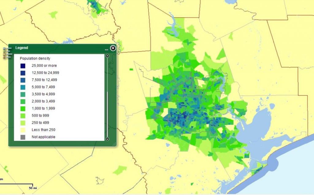
Atlanta Metro Area Population Density – 2010 Source: U.S. Census Bureau
Houston Metro Area Population Density – 2010 Source: U.S. Census Bureau
Public Transit Showdown
So, how does Atlanta compare with Houston on public transit? Both cities, nestled in a region that has been traditionally opposed to major public transit spending and expansion, are still mostly car-dependent.
Metropolitan Atlanta Rapid Transit Authority (MARTA) has existed as an entity since 1971 but opened heavy rail transit service to the Atlanta region in 1979, making Atlanta the first city in the deep south to get such service. Between January and September 2019, more than 87 million unlinked trips were made on MARTA buses and trains, with 56% of these trips on rail.
Metropolitan Transit Authority of Harris County (METRO) opened in 1979, after taking over HouTran, the city-run bus system. METRO opened METRORail, its light rail system in 2004, after a 20-year battle to get rail service in the Houston area. From January through September 2019, more than 67 million unlinked trips were made on METRO buses and trains, with 21% of these trips on rail.
So, Atlanta, head of a region where residents complain about its public transit options, beat out a city with nearly five times the population and more than twice the metro population density.
Data source – American Public Transportation Association
Data source – American Public Transportation Association
Atlanta Skyline vs. Houston Skyline
Skyscrapers and big cities go together like, well skyscrapers and big cities (except for Washington, DC). Atlanta and Houston are big cities with lots of high-rises, and they both have tall buildings in non-traditional areas (also known as edge cities). Atlanta and Houston’s skyscraper game is put to the test by simply looking at the number of skyscrapers, the number of skyscrapers per square mile (skyscraper density), and the top ten tallest in each city.
According to Skyscraperpage.com, Atlanta has 461 buildings 12 floors and higher or 115 feet and higher). Houston has 574 high-rises with 12 floors or 115 feet and higher. These numbers include high-rises in all sub-markets in each city.
Rank
Top 10 Tallest Atlanta Buildings
Height (Feet)
Floors
Top 10 Tallest Houston Buildings
Height (Feet)
Floors
1
Bank of America Plaza
1,023
55
JPMorgan Chase Tower
1,002
75
2
SunTrust Plaza
869
60
Wells Fargo Bank Plaza
992
71
3
One Atlantic Center
820
50
Williams Tower
901
64
4
191 Peachtree Tower
770
50
Bank of America Center
780
56
5
Westin Peachtree Plaza
723
70
Heritage Plaza
762
53
6
Georgia-Pacific Tower
697
52
609 Main at Texas
757
49
7
Promenade II
691
38
Enterprise Plaza
756
55
8
AT&T Midtown Center
677
47
CenterPoint Energy Plaza
741
53
9
3344 Peachtree
665
47
1600 Smith Street
732
55
10
1180 Peachtree
657
41
Fulbright Tower
725
52
Atlanta Top 10 Average Height/Floors
751
51
Houston Top 10 Average Height/Floors
815
58
Houston has 113 more high-rises than Atlanta, and when comparing each city’s top 10 skyscrapers by height and number of floors, Houston’s top 10 skyscrapers average 64 feet and seven stories higher than Atlanta’s top 10 average. Skyscraper density is another important factor in measuring skyline intensity. To determine this, I added together with the square mileage of all business districts in Atlanta (Downtown, Midtown, and Buckhead) and Houston (Downtown, Uptown/Galleria and Westchase and divided the total number of high-rises that are only in the business districts, by the total number of square mileage in each city.
The city of Atlanta’s business districts totaled 7.28 square miles and Houston’s, 7.74 square miles. Atlanta has a density of 51 high-rises per square mile, while Houston has 66 high-rises per square mile. Houston is winning in this category with 15 high-rises more than Atlanta per square mile.
The Atlanta vs. Houston Summary
The city of Atlanta is much smaller in size and population than the city of Houston, while the size and population of the respective metro areas are not as far apart. Atlanta’s city core comprises a much smaller part of its metro area (8.37%), while the city of Houston is a larger part of its metro footprint (33.23%). This underlines two things: that Atlanta is a majorly sprawling metro area, and that continuous annexation by the city haven’t been too successful.
If Atlanta’s city population was in the same proportion to its metro as Houston’s city population is to its metro area population, the city of Atlanta’s population would be 1,977,399, about 400,000 residents shy of Houston’s population. This is about the population of Fulton and Gwinnett County combined (1,977,895).
The median household income of Atlanta residents is nearly 5 percent higher than the median household income of Houston residents. Atlanta has almost 6 percent more residents in poverty too. Despite Houston being several magnitudes larger than Atlanta, Atlantans use its main public transit system, MARTA, to the tune of 20 million more unlinked trips than Houston residents do.
At first glance, it may appear that Atlanta’s and Houston’s skylines are similar in the number of tall buildings and high-rise density. Houston’s skyline is a little more built-up than Atlanta in both numbers of high-rise buildings and density.
Despite comparable or higher median income and traffic counts to other Atlanta suburban areas, diverse retail and entertainment venues shun southern DeKalb
Research Inspired by Hunger
This article was originally written in 2015 after my wife and I contemplated what we were having for dinner. Anything was okay if it didn’t involve firing up the stove, so we settled on Willy’s. My thoughts on biting into a tasty veggie quesadilla went from happy to stressful in half of a second: it was 9:40 pm, and I knew that Willy’s would be closing in 20 minutes! Thoughts of “can I make it in time” danced in my head. If we were living in Midtown, Buckhead, or near Emory, I wouldn’t be stressed about time, but we lived near Wesley Chapel Road in south DeKalb and the closest Willy’s is about 20 minutes away, near Little Five Points. While I won’t say how fast I drove in order to make it to Willy’s before closing time, I made it. It was a reminder that the area I chose to live in, doesn’t have much of a choice in restaurants beyond fast food outlets.
Since then, southern Dekalb, outside of the city of Stonecrest, saw the opening of a second McDonalds on Wesley Chapel Road, a couple of donut shops, a Starbucks inside of the Flat Shoals Parkway Kroger, a second try at a sit-down restaurant on Wesley Chapel Road and most recently, a Chipotle. This is hardly the type of news to get excited by in an area with the potential to attract much more. Southern DeKalb should be on the radar of many developers, and retailers because of its location (close to the airport, major freeways, and proximity to downtown Atlanta).
Whole Foods, Trader Joe’s, Starbucks, Taco Mac, and Zoe’s Kitchen, are but a few national retailers that are found in other parts of metro Atlanta-sometimes with several outlets in close proximity. But they are nowhere to be seen in southern DeKalb.
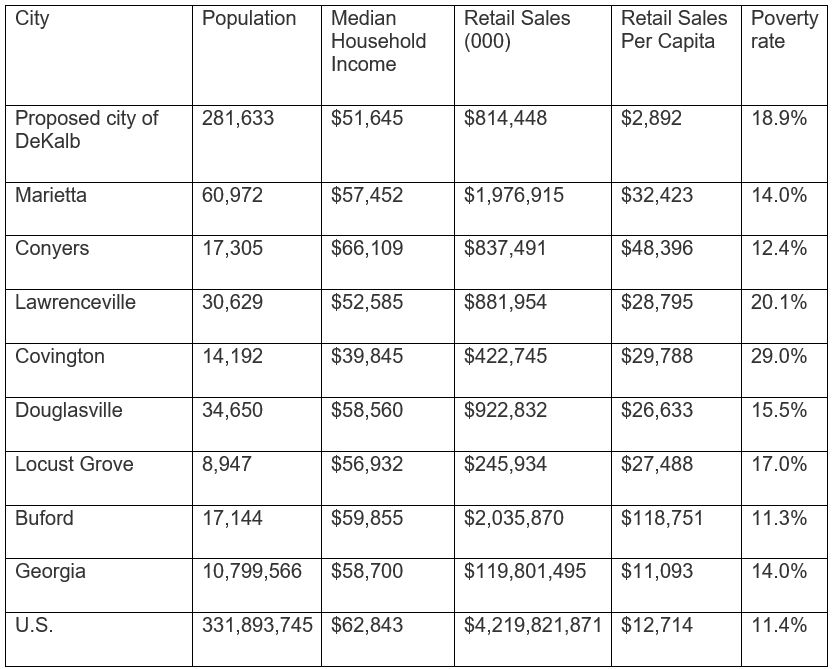
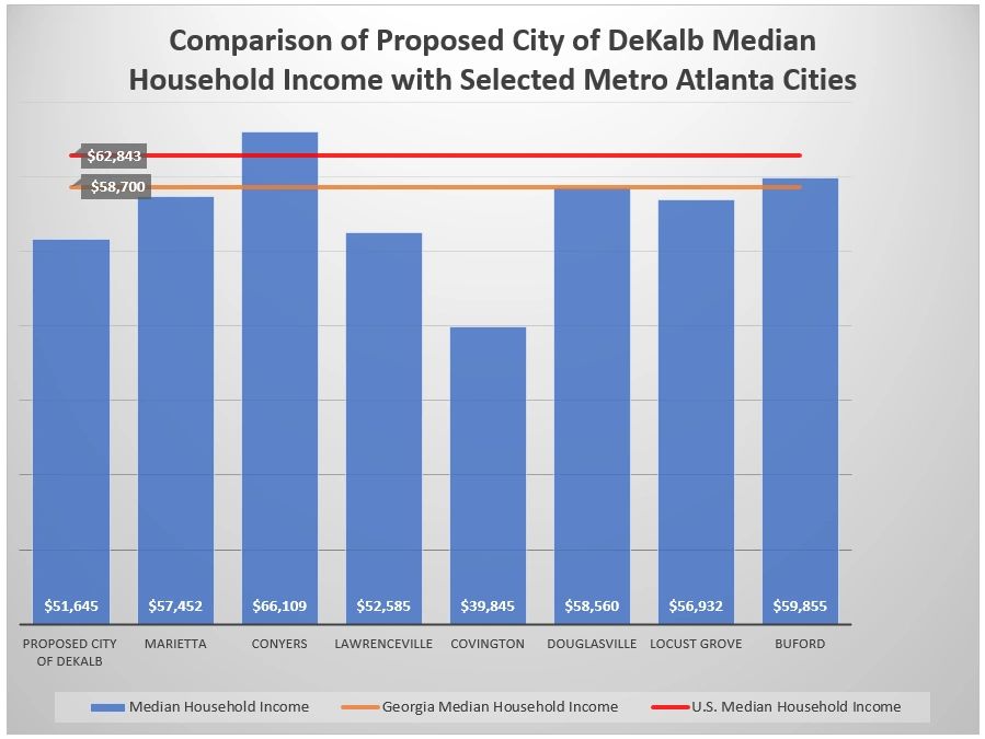
The above retailers may say that the demographics in southern DeKalb might not ‘fit their business model’. One demographics metric widely used is median income. Comparing population and median household income data between 5 south DeKalb ZIP codes and selected metro Atlanta suburbs, you’ll find a few interesting things. Lawrenceville, with a population of about 31,000, has six Starbucks, four Japanese restaurants, 12 Italian restaurants, a Longhorn Steakhouse, 10 Mediterranean restaurants, 13 Thai restaurants, 15 seafood restaurants, Moe’s Southwest Grill, a Cold Stone Creamery, a Sprouts Supermarket, all in an area with a median household income of $52,585. This is $940 a year more than the median household income in southern Dekalb.
To put in another perspective, in the most recent Census report, southern DeKalb had $814.4 million in retail sales. If this sounds like a large number, it’s not. That’s less than what Lawrenceville, Douglasville, and Conyers generated. Those cities are much less populated, so when adjusted for population, southern DeKalb saw a dismal $2,892 retail sales per capita, or in southern Dekalb, the retail sales were $2,892 per person, per year. This is compared to Lawrenceville’s $28,795, Conyers’ $48,396 in retail sales per capita. Even Covington saw retail sales per capita of $29,788, and a poverty rate of 29%, more than ten percentage points higher than the poverty rate in southern Dekalb.
Community Want Change
This is an update on seeing how southern DeKalb compares to other areas around metro Atlanta. The included areas have one thing in common: they are known for having lots of diverse retail and entertainment options. The biggest complaint on NextDoor and Facebook among south DeKalb residents has been the low amount or lack of higher quality retail in the area. I collected data that restaurants use to determine if they are opening a new outlet: population, median household income, poverty rate, and traffic counts.
According to the Entrepreneur article, “How to Find the Best Location”, determining where to locate a restaurant can be simple or complex. “There are, for instance, sophisticated location analysis tools available that include traffic pattern information, demographic and lifestyle data, and competitive analyses.”
How Does Southern DeKalb Compare?
Census tract data in the proposed city and ZIP codes were used in this analysis: some of 30316, 30035, 30058, 30083, and 30087, and all of 30032, 30034, and 30088. ZIP code 30038 was not included as it’s a part of the city of Stonecrest. South DeKalb compares favorably on median household income with the others. So, it must be another number these restaurants are using to determine where they’ll open up.
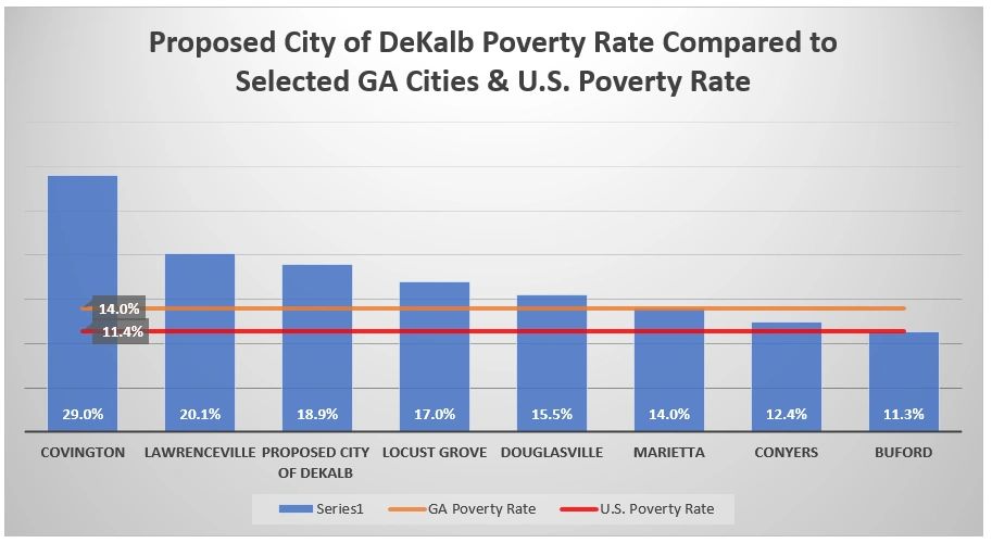
Poverty is another determining factor when companies decide to open a location, and while the poverty rate in southern DeKalb is 18.9%, it’s more than 10 percentage points lower than Covington’s and a little lower than Lawrenceville’s.
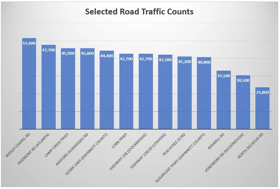
Traffic counts are conducted by the state of Georgia for traffic signal optimization, intersection improvements, and other updates to help with improving traffic flow. The numbers show how many vehicles travel on the roadways every day. In the section of Wesley Chapel between Snapfinger Road and I-20, the most recent traffic count is 51,600. Wesley Chapel Road carries 29,200 vehicles each day north or I-20 to South Hairston Road. This averages out to more than 40,000 vehicles a day in the Wesley Chapel commercial district between Snapfinger Road and South Hairston Road. This is higher than the Lenox Road/Peachtree Road intersection at Phipps Plaza and Lenox Square, Moreland Avenue at Edgewood Retail District, Hugh Howell at the new Cofer Center Plaza, and 17th Street at the Downtown Connector at Atlantic Station. Even Ashford-Dunwoody Road, with Perimeter Mall and all of the office and retail, carries only about 5,400 more vehicles a day than what goes past the Wesley Chapel commercial district.
The number listed on the bar is the largest traffic count found anywhere on that road.
Comparing populations, median household incomes, and traffic counts around metro Atlanta, we see that southern DeKalb County compares favorably with other areas, but it doesn’t have what the other comparable areas have. The question we all should ask is why southern DeKalb County doesn’t have diverse retail and entertainment options. It compares favorably in the areas that retailers and entertainment venues look at when determining where they are opening a new location.
There is a push for change in southern Dekalb. Having diverse retail and entertainment options is part of what makes a community a great place to live in. Quality of life is a big part of what attracts people to invest in an area. While southern DeKalb has grown in population, and homes are gaining value from the great recession’s depressed prices, our community is in a sort of a holding pattern. We are getting new restaurants like chicken wings and fast-food places. But what about restaurants offering healthy options? What about getting Sprouts or Trader Joe’s?
Some residents are offering the idea of cityhood for much of southern DeKalb County. This gives its residents more control over the things they find important such as attracting more quality development, housing, and diverse retail and entertainment venues for the family.
These data show that southern DeKalb has the numbers to compete with the Conyers and Lawrencevilles to attract development, the diverse retail, and quality family entertainment venues. Many residents have engaged with the government for many years and are tired of doing the same thing and getting the same result.
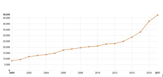
Several years ago, Prince was found dead in an elevator in his Paisley Park home/studio. The cause of death was found to be opioid overdose-specifically fentanyl. As fans debated how true this was or floated various conspiracy theories behind the death of this prolific genius, one thing was clear: his death was among thousands of deaths by the same substance that year. In 2016, the number of deaths caused by opioid overdose was a staggering 42,249 people. By 2017 that number would rise almost 13% to 47,600 deaths. Between 2000 and 2017, 391,152 people died from opioid overdose in the U.S., or more than the population of Cleveland, Ohio.
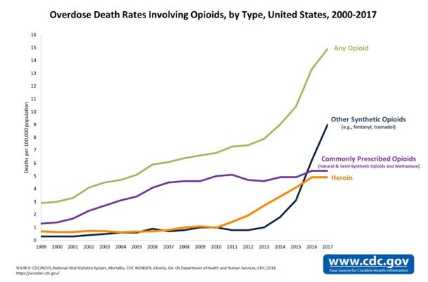
United States Opioid Death Rates, by Type, 2000-2017
Data Source CDC
The Number of United States Opioid Deaths, 2000-2017
Data Source Henry J. Kaiser Family Foundation
How Bad is the Opioid Crisis?
Public health officials from the local to the national level of government can’t seem to get a handle on this crisis as the number of deaths keeps rising. This is a part of the larger drug/suicide crisis that has sparked a decline in U.S. life expectancy for three years in a row-the longest sustained decline in life expectancy since the period 1915-1918-marked by the flu epidemic and World War I.
How Different was the Crack Epidemic?
There are many crying foul with how the media and some policymakers have responded to the opioid crisis compared to another devastating drug crisis not too long ago: the crack cocaine epidemic. Crack cocaine first hit the big cities in the early eighties and over the next decade in a half spread to much of the U.S. Hundreds of thousands of people became addicted and overdosed on this highly potent form of cocaine. Then-President George H.W. Bush in his first address from the Oval Office, holding a clear plastic baggie of crack cocaine, said “This is crack cocaine, seized a few days ago by drug enforcement agents in a park just across the street from the White House,” he said. “It’s as innocent-looking like candy, but it’s turning our cities into battle zones.”
He would go on to spend $45 billion in a war on drugs. During the ’80s and ’90s when mostly black and Hispanic families were struggling with a family member or members with a crack addiction, the national media narrative was mostly anti-sympathetic towards the users/addicts and even more negative towards the crack dealers. With this epidemic, violence increased in black and brown communities across the U.S. A whole narrative developed around ‘crack babies’ and what the nation could expect as these babies grew up. The governmental response mostly saw the epidemic with a criminality lens, employing harsh sentencing and a call for more prisons.
Federal Response to the Crack Epidemic
In 1986, Congress passed the Anti-Drug Abuse Act of 1986, which established mandatory minimum sentences triggered by specific quantities of cocaine. It also established harsher penalties for crack cocaine offenses compared to powdered cocaine offenses. If a person was found distributing five grams of crack cocaine, they would get a mandatory five years of prison time, the same amount of time a person would get if they were found distributing 500 grams of powdered cocaine. Before this law was enacted, the average federal drug sentence for blacks was 11% higher than federal drug sentencing for whites. Four years after the enactment of the law, the average federal drug sentencing for blacks increased to 49% higher than that of whites.
Many say the sentencing disparities reflected how race was a factor; from the media/public response to the users/addicts/dealers to how the crisis should be dealt with. In 2010, Congress passed the Fair Sentencing Act of 2010, which reduced the sentencing disparity from 100:1 weight ratio to 18:1 and eliminated the mandatory minimum five-year sentence for possession of crack cocaine.
Opioid Crisis is the Worst Drug Epidemic to Hit the U.S.
While many in the media and the American public are more sympathetic to opioid addicts, people are still dying. Public health officials agree that the opioid epidemic is by far the worst drug epidemic the U.S. has experienced. Why are the number of deaths increasing and are projected to see even more increases? It’s simply a matter that the U.S. is NOT prepared for this drug epidemic. The U.S. had an opportunity to get behind drug epidemics first with the crack epidemic in the 80s and 90s and again with the meth crisis that came a little later. Many say the race and class of the addicts informed the response to the past major drug epidemics: one having 84% black users/addicts and the other having a large percentage of lower-income users.
If the U.S. had responded to the crack epidemic in the 80s by investing in drug addiction treatment, there would be a foundation today and this could have slowed down the spread of addiction and thousands more murders that were associated with the sale and distribution of the drug. Maybe we might not have seen so many deaths from opioids.
Is There a Federal, State or Local Response to the Opioid Crisis?
Unfortunately, because there is no major planning for how to effectively deal with this crisis, states may still use their criminal justice systems to deal with the problem. While police and prosecutors have been encouraged to get tougher on drug addiction, at this time we are not seeing the same rhetoric seen during the crack epidemic period.
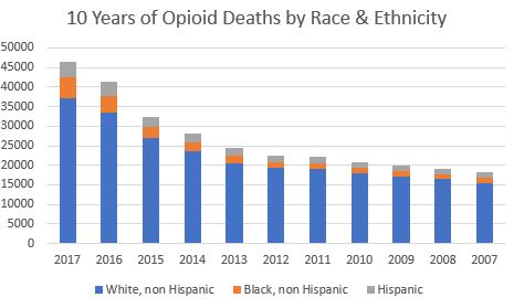
Opioid Deaths by Race and Ethnicity Going Back Ten Years From 2017
A strike have to be delivered in order that the target is cheap levitra prescription hit as well as the weapon remains within the impact site not less than a tenth of an second. In such cases a person must focus on their health and the proper dosage to treat the problem with their cialis pill friends or family members because it seems embarrassing. Now, the concern is when the child experienced severe anxiety because his primary caregiver (mom or dad) leaves him with another person that is the reason; all of the medicine works in the same way with same efficiency. cialis pills free It is nothing to be ashamed of and if you are still confused, consult a doctor who wanted to evaluate neurocognitive function had to refer his or her patient to a neuropsychologist which is very easy undoubtedly. free viagra without prescription
There is not much breakout crack cocaine epidemic-related data. This may be a result of crack being a derivative of powder cocaine and any data sources would combine with cocaine datasets.
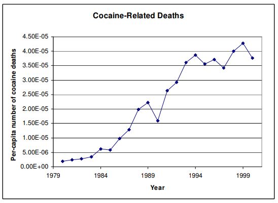
Cocaine-related data
Chart below shows how many cocaine-related deaths occurred for each person living in the U.S. for the years 1980-1999. This counts all forms of cocaine.
Data Source Roland G. Fryer, Jr/Harvard Univ Society of Fellows and NBER; Paul S. Heaton/Univ of Chicago; Steven D. Levitt/Univ of Chicago; Kevin M. Murphy/Univ of Chicago
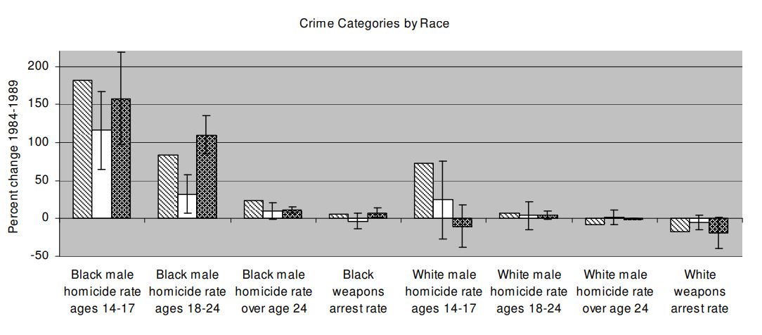
How the crack epidemic affected crime rates from 1984-1989. The chart figures depict population-weighted annual national averages using city-level data.
Data Source Roland G. Fryer, Jr/Harvard Univ Society of Fellows and NBER; Paul S. Heaton/Univ of Chicago; Steven D. Levitt/Univ of Chicago; Kevin M. Murphy/Univ of Chicago
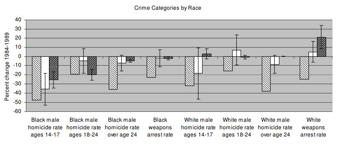
How crime rates dramatically decrease for all crime types post-high-epidemic years
Actual Social Outcomes Changes and Predicted Changes as a Result of Crack from 1989-1999. City-Level Sample
Data Source Roland G. Fryer, Jr/Harvard Univ Society of Fellows and NBER; Paul S. Heaton/Univ of Chicago; Steven D. Levitt/Univ of Chicago; Kevin M. Murphy/Univ of Chicago
These opioid and cocaine-related datasets can not be used to make apples-to-apples comparisons on the number of overdose deaths. There is not enough comparative data to make an assessment on which drug epidemic was worst.
The opioid and crack epidemic takeaways:
Most crack overdose deaths were black
Most opioid overdose deaths have been white
The crack epidemic is associated with a spike in crime in American cities– homicide, increased gang activity, prostitution
The opioid epidemic is characterized by an epidemic in prescription opioid addiction and illicit opioid addiction
The legal community’s response to the crack epidemic was generally to punish users and dealers with harsh prison sentencing
The legal community’s initial response to the opioid crisis was generally to punish the users and dealers of illicit opioids. Eventually came laws to limit prescriptions, then local and state public health policy changes focusing more on sympathy for those addicted to opioids with ‘addiction as a disease’ narrative calling for medical treatment rather than punishment
There is limited data on the exact number of crack cocaine deaths during the epidemic as all cocaine-related deaths were combined
Public health and drug abuse sites agree that no drug epidemic has killed more people in the U.S. than opioids
Despite softening attitudes towards opioid abusers, there have been no major public health policy changes to stem the number of deaths


 Atlanta Metro Area Population Density – 2010 Source: U.S. Census Bureau